My Digital Health
A digital health platform designed to give users control over their personal health data — with a focus on clarity, accessibility, and long-term engagement.

The challenge
In the HealthTech space, most platforms are built for healthcare professionals, not the patient. The result is a dense, anxiety-inducing experience that is difficult for non-technical users to navigate.
- Interfaces overloaded with uncontextualised clinical data
- No visual hierarchy in personal health dashboards
- Accessibility overlooked despite the target audience including elderly users
- No consistent visual identity — each section felt like a different product
- High drop-off rate after the first login due to perceived complexity
Solution
Redesign the experience with a human-centred, accessibility-first approach — treating WCAG 2.1 AA compliance as a project requirement, not an afterthought.
- Dashboard with clear hierarchy: critical data upfront, details on demand
- Medical yet warm visual identity that reduces health-related anxiety
- WCAG 2.1 AA compliance as a core design requirement
- Progressive onboarding to reduce initial cognitive overload
UX Strategy
User Research & Personas
3 profiles identified: the chronic user (managing an ongoing condition), the preventive user (monitoring health without illness), and the caregiver (managing a family member's health).
Accessibility-First Design
Every decision validated against WCAG 2.1 AA: minimum contrast ratio 4.5:1, visible focus states, 44×44px touch targets, screen reader support on all interactive components.
Dashboard Architecture
The main dashboard follows progressive disclosure: 3–5 key metrics surfaced upfront, with drill-down into history and detail. The user always sees "how am I doing today" first — not "all available data".
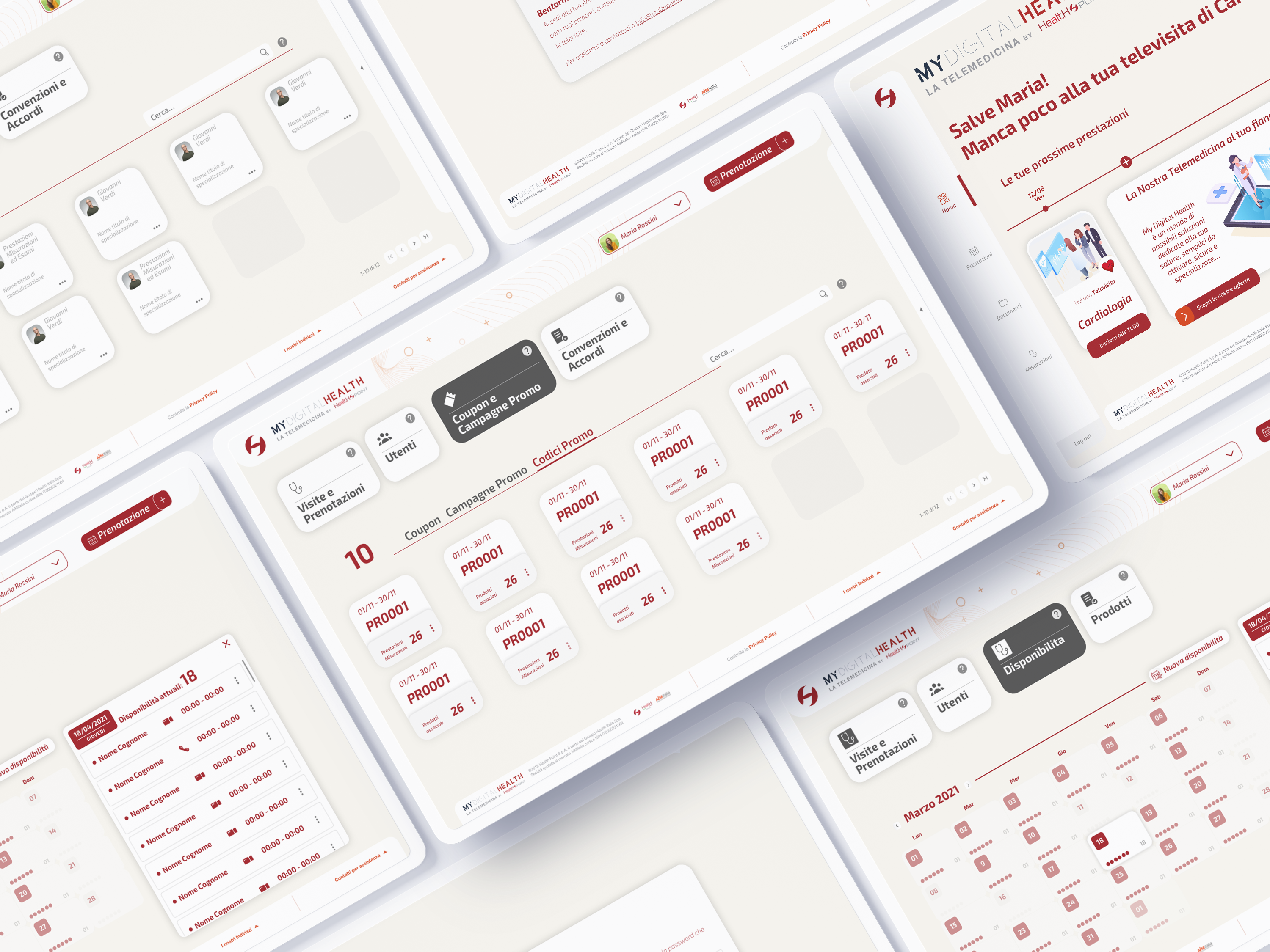 Platform overview · web app, mobile app, and admin dashboard · all key views
Design System
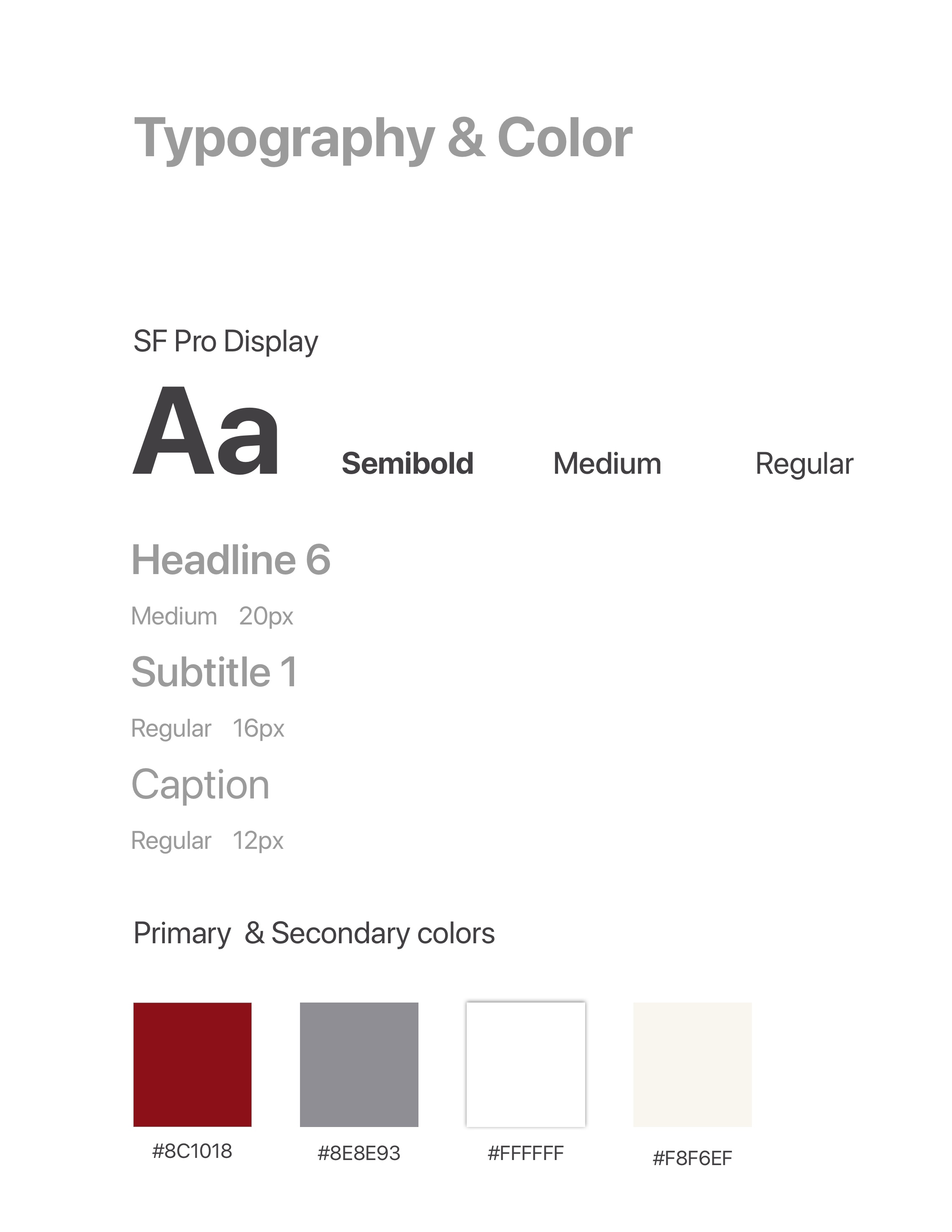 Colour palette & typography scale
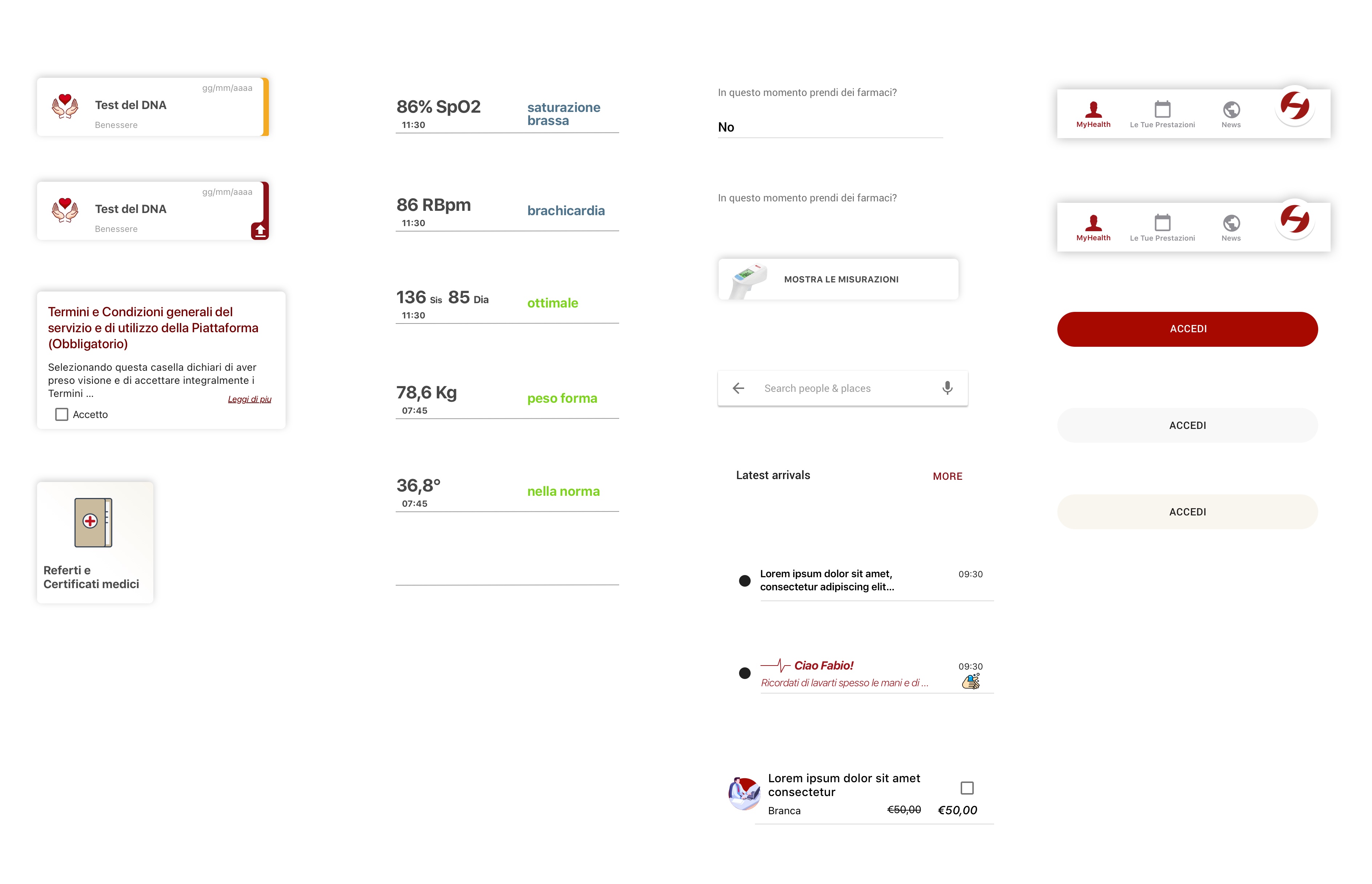 Component library · cards, buttons, navigation
Foundation
Palette: desaturated medical blue (professionalism), health green (positivity), attention orange (non-anxiety-inducing alerts), warm neutrals for backgrounds.
Core components: health metric card, trend chart, alert banner (3 severity levels), appointment card, medication tracker, navigation sidebar.
Key Screens
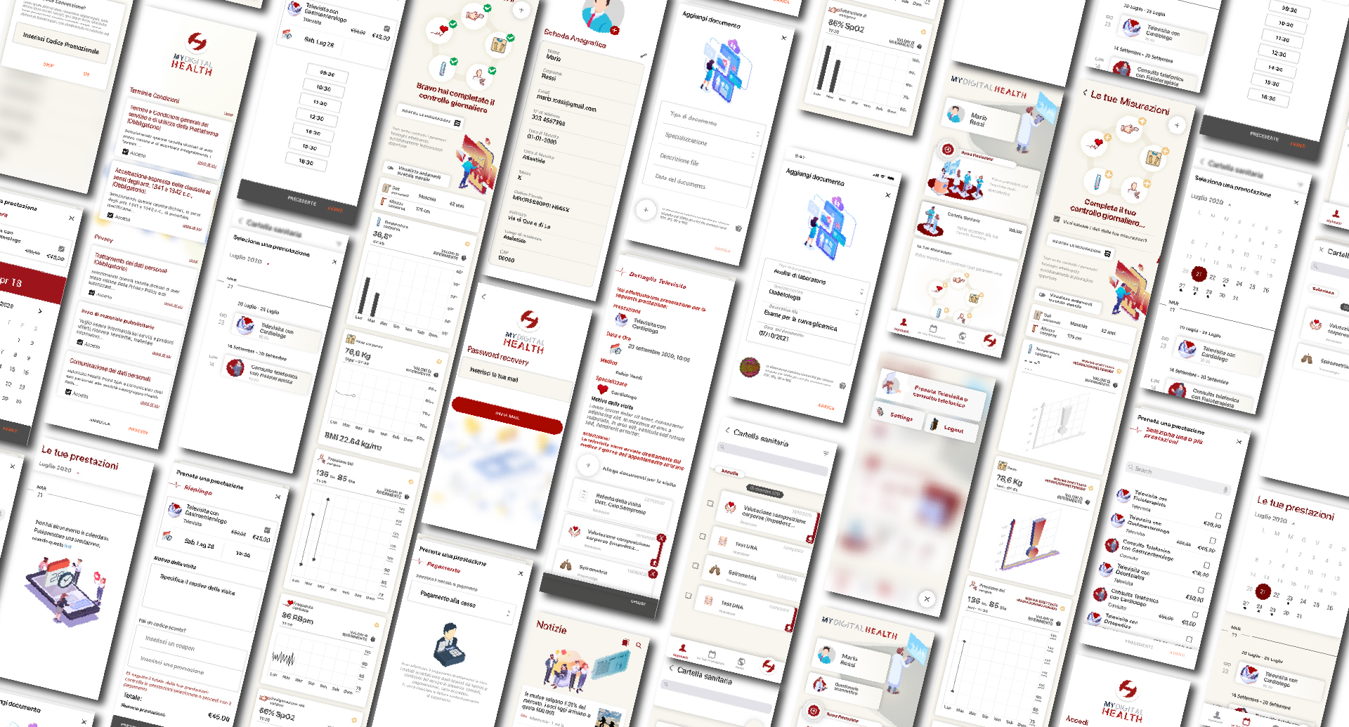 All key screens · complete user journey from login to health tracking · 2022
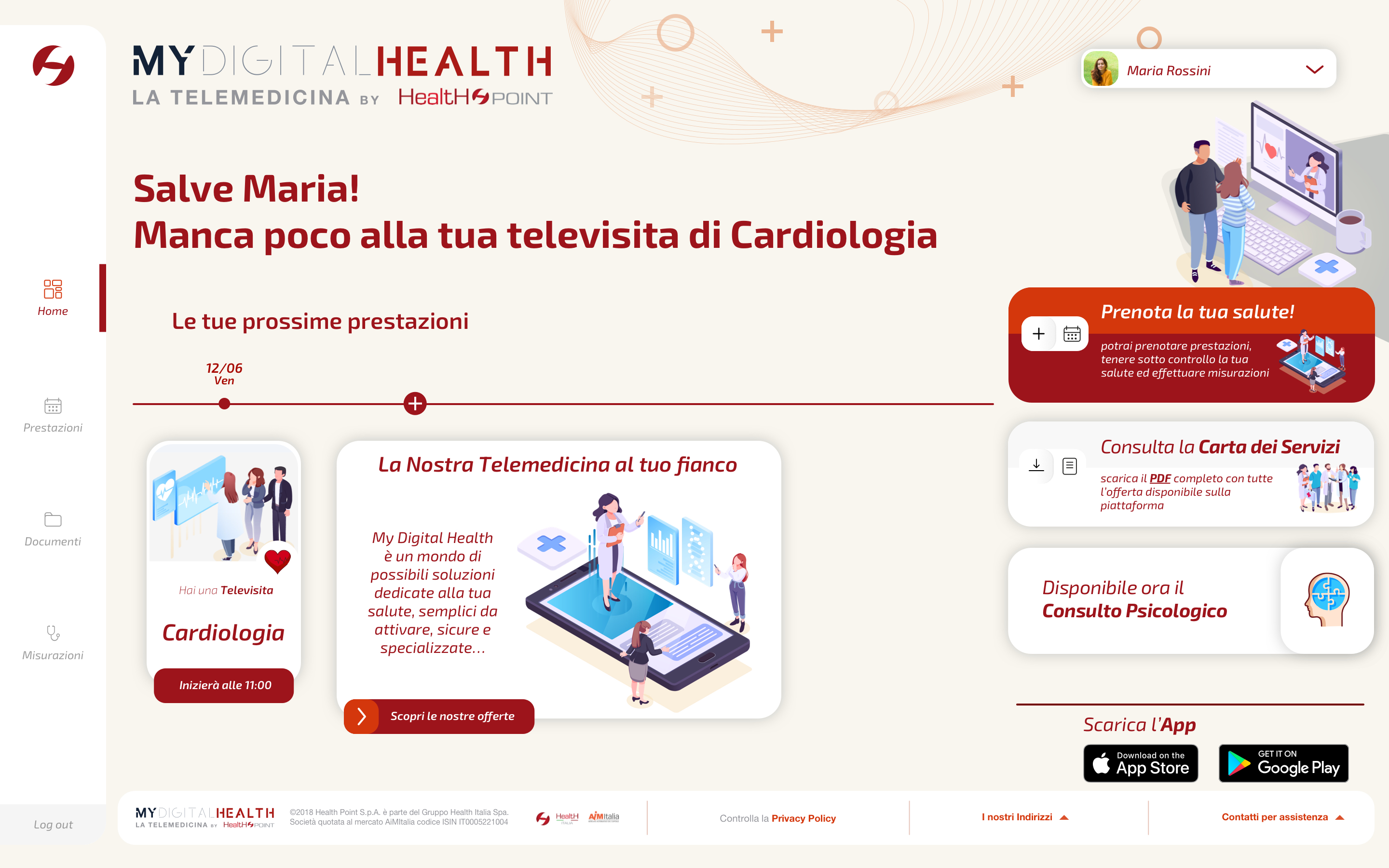 Dashboard · upcoming appointments and personal health summary
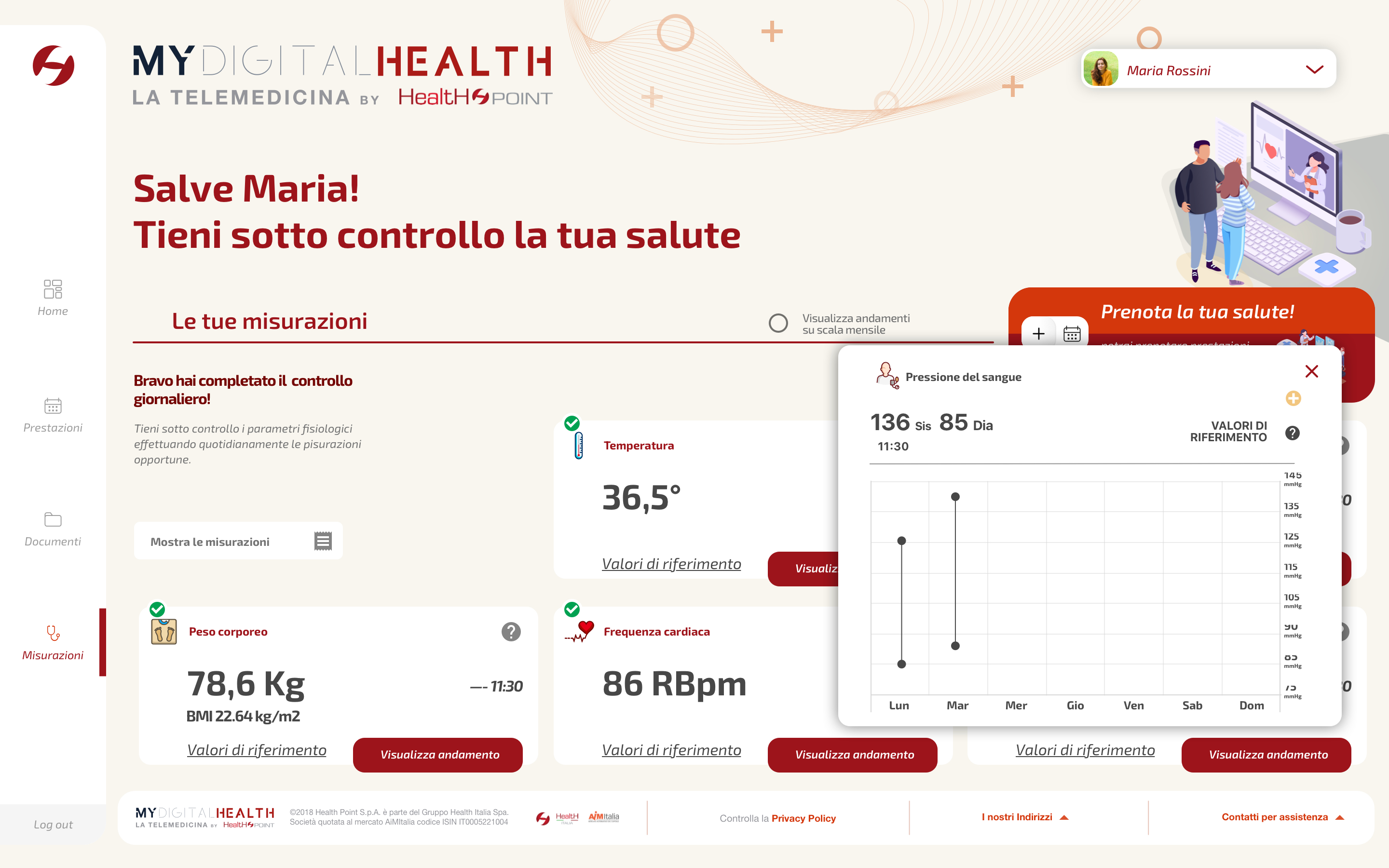 Measurements · blood pressure chart and trend analysis
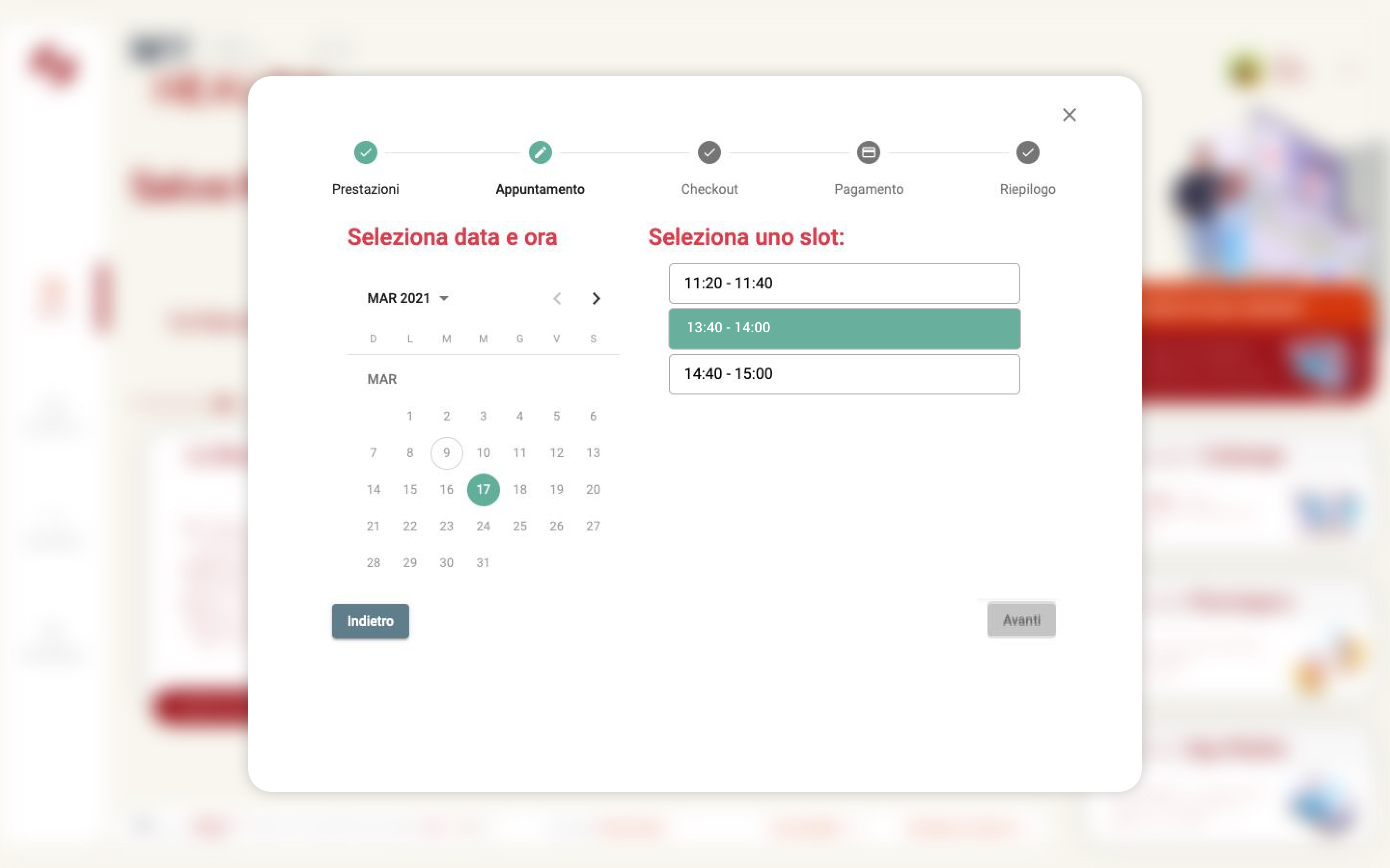 Appointment booking · calendar selection and 5-step checkout flow
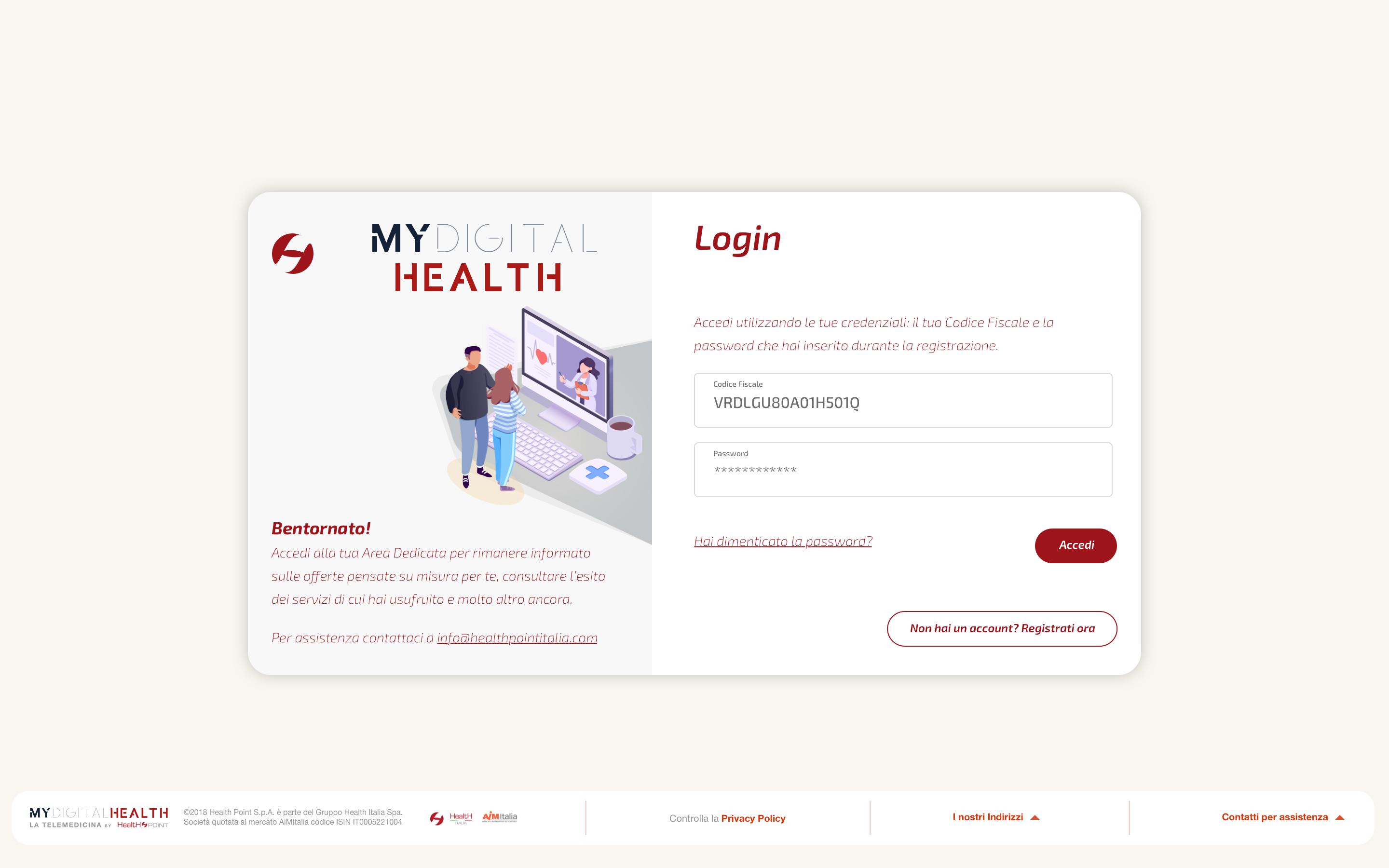 Access · login screen and onboarding entry point
Impact & Outcomes
Results
WCAG 2.1 AA compliance verified across all interactive components. Onboarding completion rate significantly improved through progressive disclosure and reduced field count.
Learnings
The biggest challenge was convincing the team that visual simplicity doesn't mean less information — it means the right information at the right moment.
Progressive disclosure became the foundation of every design decision in the later stages of the project.