Bizim Tarla
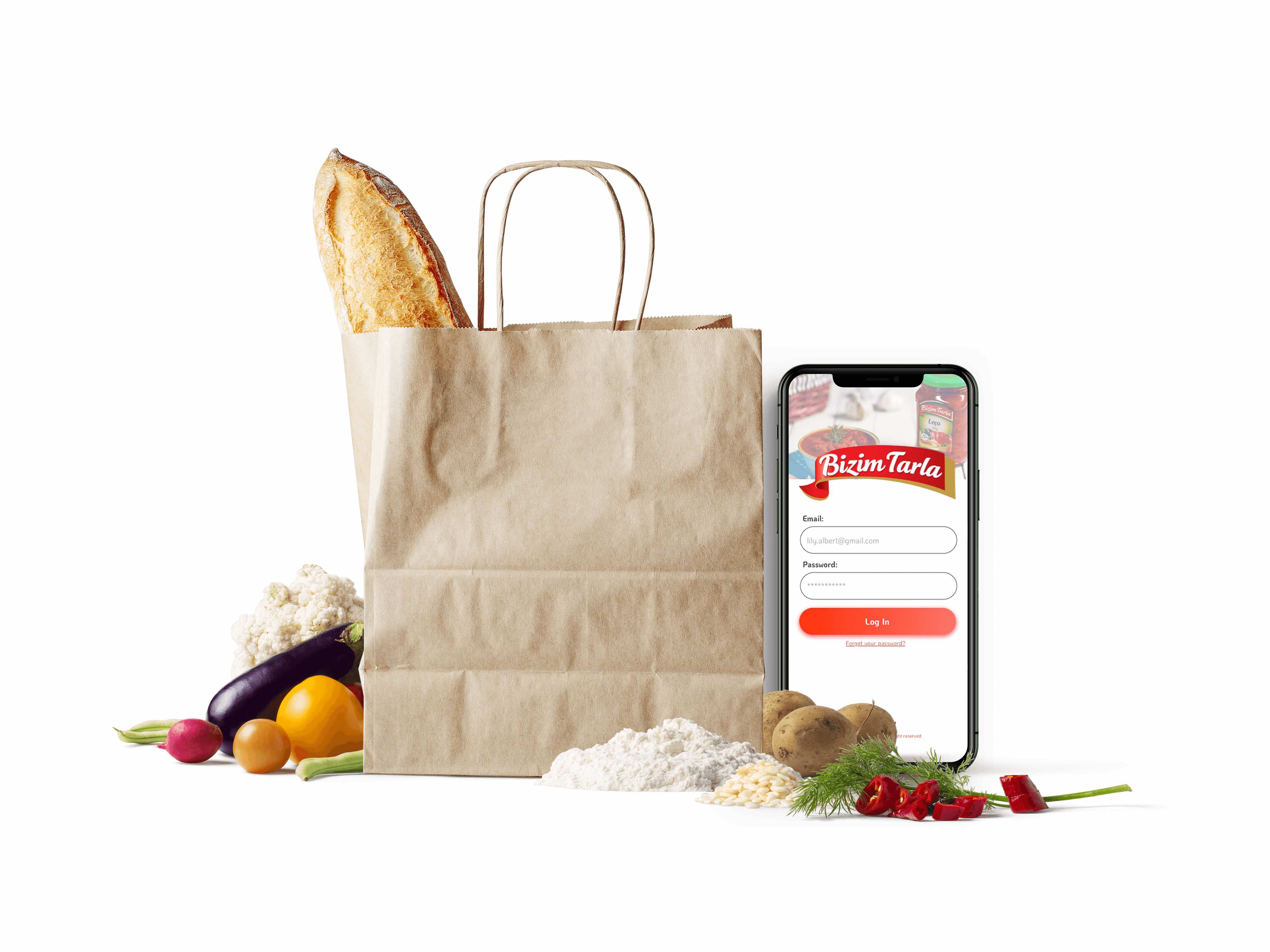
A farm-to-table e-commerce platform connecting local producers with urban consumers — designed with a strong visual identity rooted in Turkish rural culture.
The challenge
"Bizim Tarla" means "Our Field" in Turkish. The project addresses a real problem: small local farmers lack adequate digital tools to reach urban consumers searching for fresh, authentic products.
- No existing platform communicated local product authenticity in a visually credible way
- Generic e-commerce platforms had no support for seasonal catalogue dynamics
- Competitors' visual identities were generic, with no cultural roots
- Mobile experience was treated as secondary, despite the target audience primarily using smartphones
Solution
Design a platform that immediately communicated authenticity and freshness, supported a seasonal catalogue, and emotionally connected the urban user with the local producer.
- Visual identity rooted in Turkish agricultural culture — coherent and distinctive
- Seasonal catalogue with adaptive UX — categories by season as well as by type
- Mobile-first design: native experience on smartphone before desktop
- The producer as protagonist — every product tells the story of its origin and farm
UX Strategy
Visual Identity & Brand System
Palette inspired by Anatolian earth tones: forest green, ochre, terracotta, natural white. Botanical illustrations integrated into the visual system to communicate craftsmanship.
Information Architecture
Structure centred on the producer as protagonist: every product has a card detailing origin, cultivation method, and farm story. Categories organised by season as well as type, with contextual filters.
Responsive Design
Mobile-first: homepage on mobile as a vertical scroll experience with large-format product cards. On desktop it expands into a 3-column grid with a persistent filter sidebar.
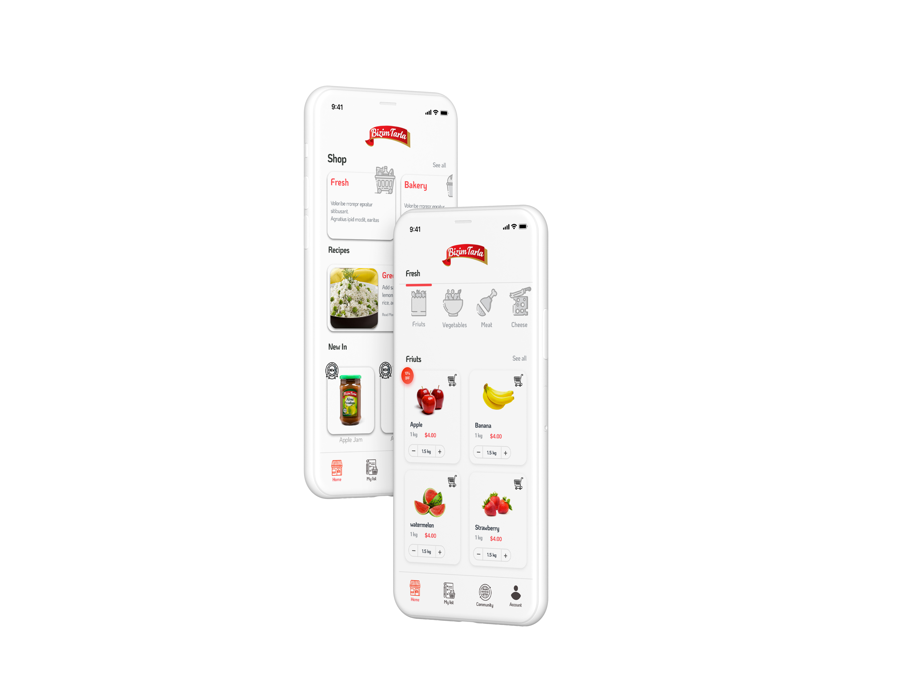 Shop home & Fresh categories · mobile-first navigation structure
Design System
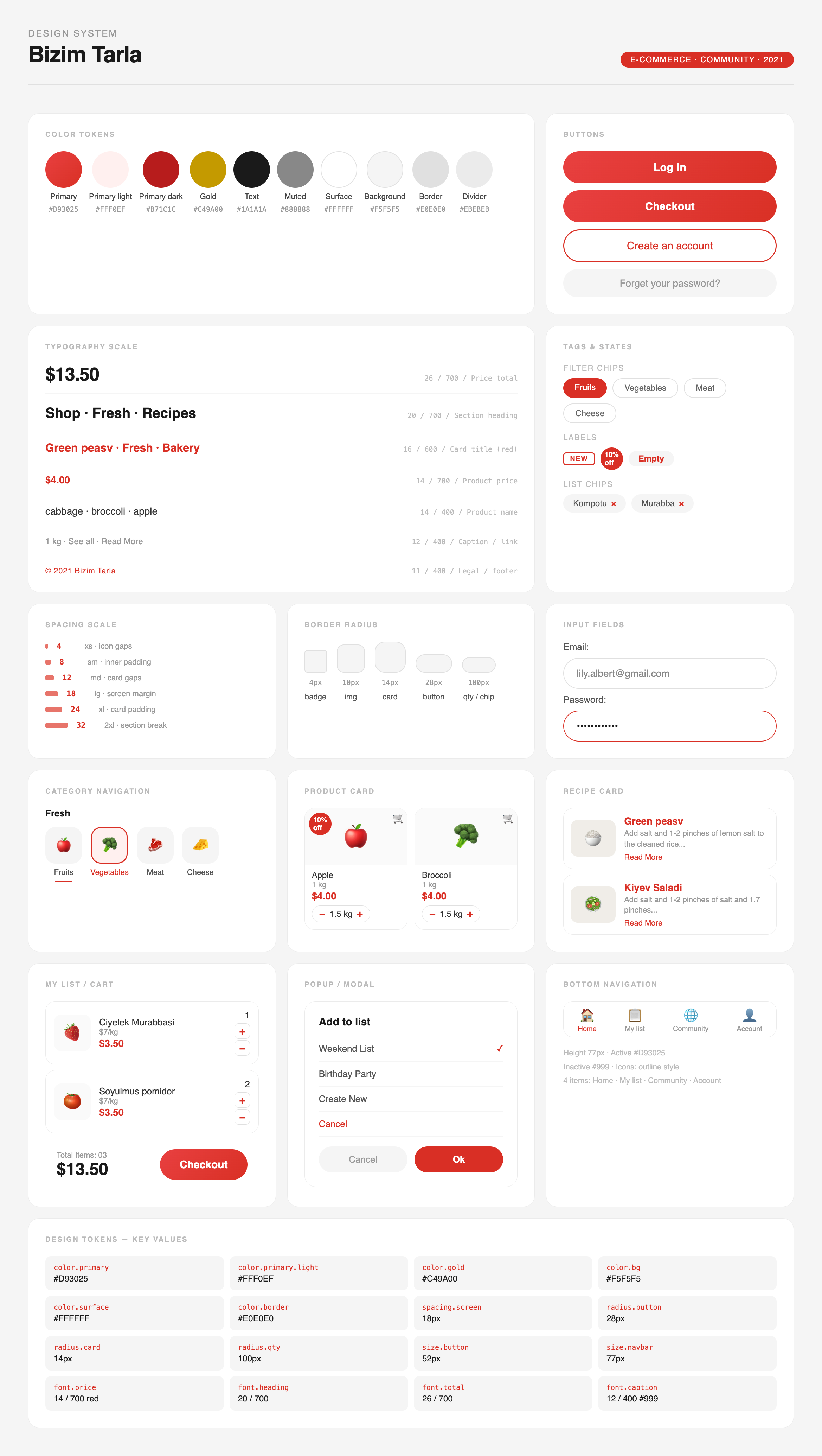 Design system · components, states, responsive variants
Component Architecture
Core components: product card (with season badge), producer card, cart drawer, step-by-step checkout, seasonal filters.
Every component designed with hover, active, empty, and error states. Seasonal badges act as an immediate visual navigation system.
Key Screens
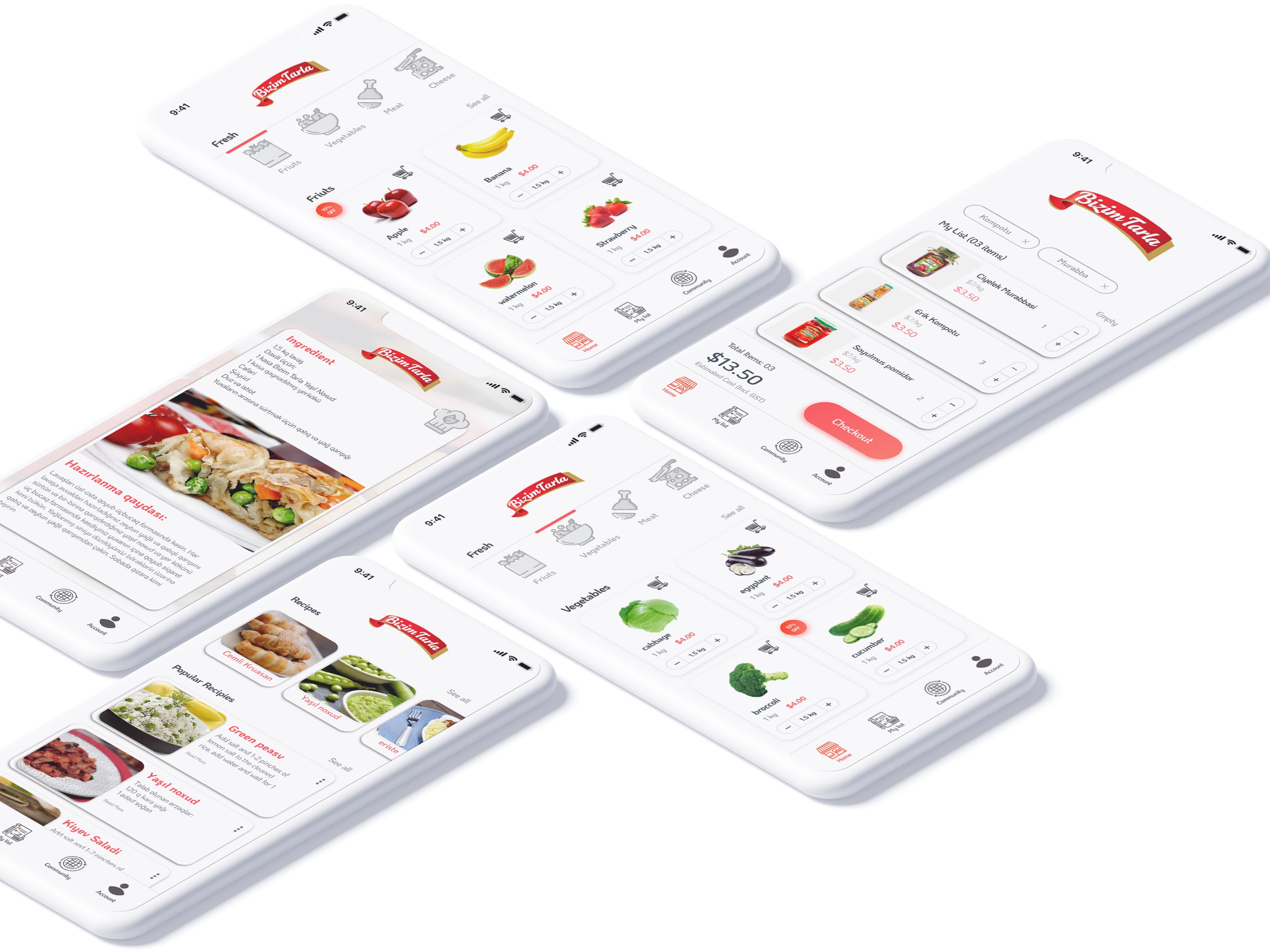 All key screens · product listing, cart, recipes, checkout · 2021
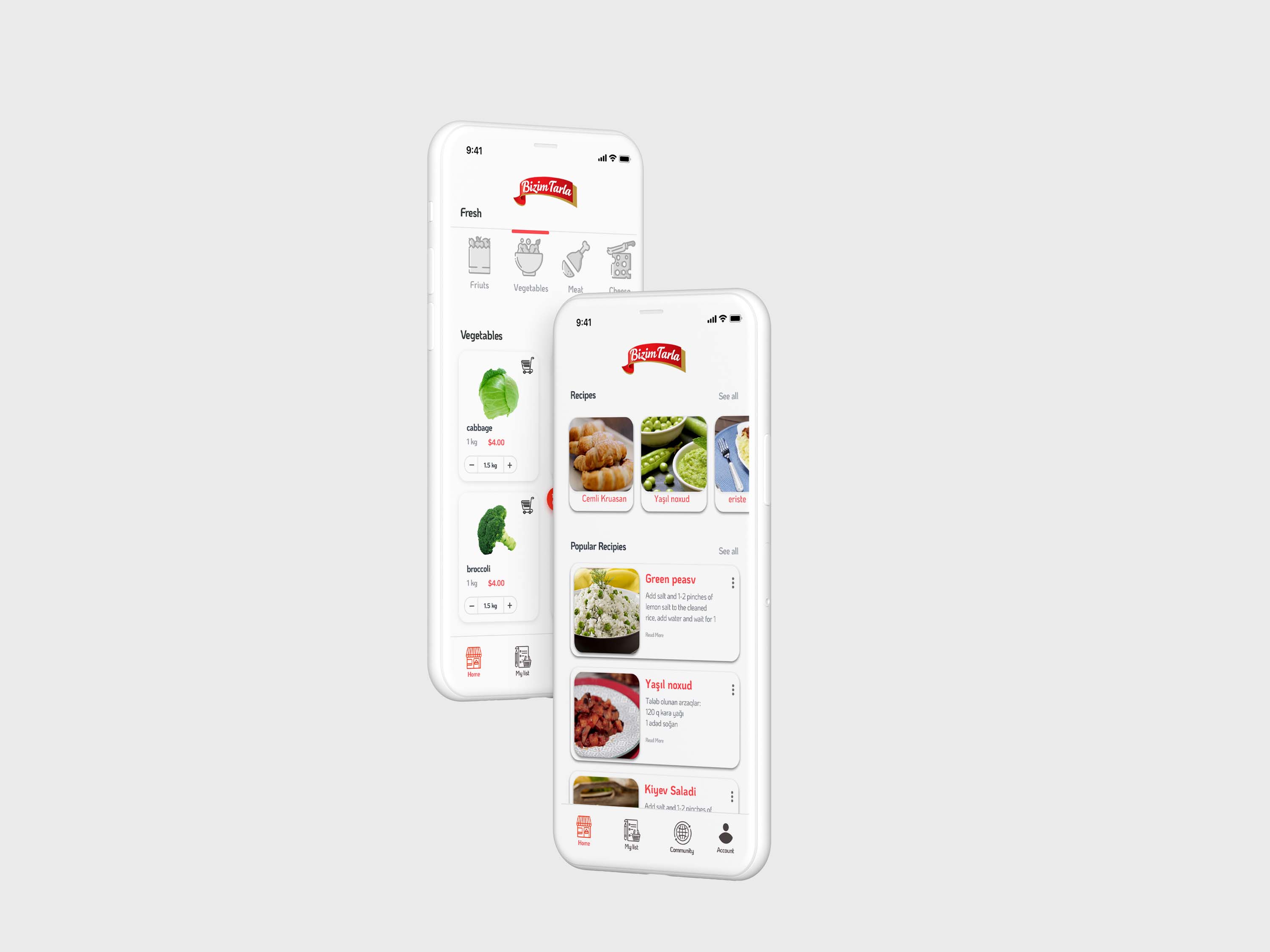 Cart, product listing & recipes · core shopping flow
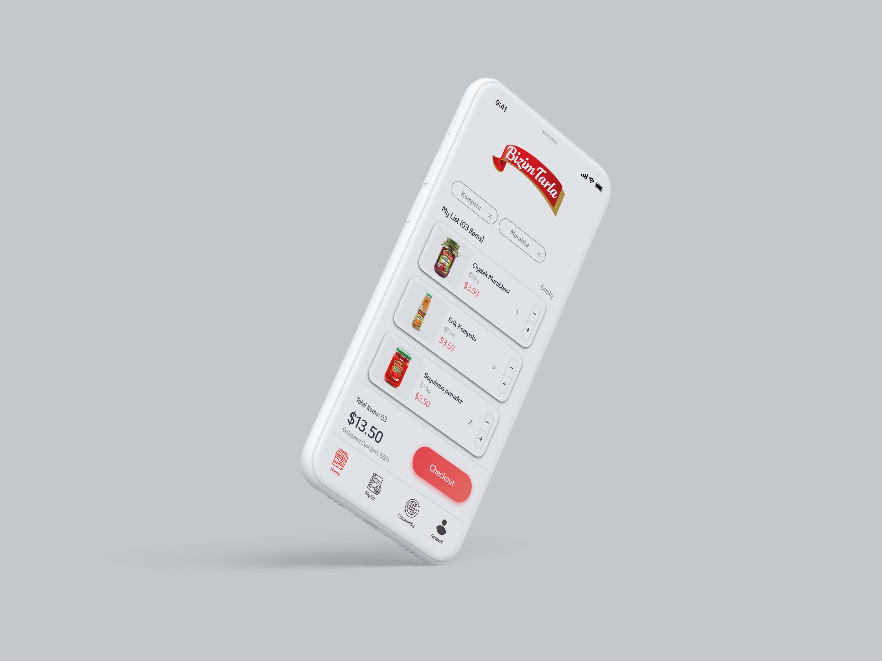 Checkout · My List with total and confirm step
Impact & Outcomes
Results
End-to-end design covering web and mobile — from brand identity and design system to all product screens and checkout flow.
Learnings
The hardest part was defining the hierarchy between visual identity and usability. Early versions were visually strong but penalised the readability of key information — price, availability, origin.
The solution was a two-speed typography system: expressive in headings, utilitarian in the UI.